We are proud to announce the latest release of dmn-js. The release focuses on the styling of DMN Decision Tables.
Readability and Contrast
Readability is improved by increasing contrast within the cells.
For reference, this is what a DMN decision Table looked like in previous releases:
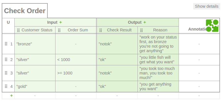
Clearly, it looks very "green" and has low contrast. The majority of the cells have a green background, using different shades of green for inputs and outputs. The text itself is of a a relatively light gray color. As a result, the contrast between the background of the cells and the text content inside the cells is not very strong.
This was improved by removing the green background for inputs and lightening the background color of outputs. The text now uses a darker shade of gray resulting in more contrast between the cell content and the cell background and thus better readability.
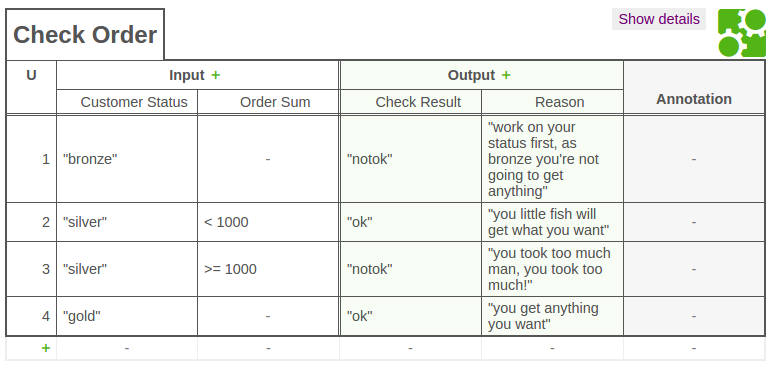
Decision Tables now also look better if they are printed out on paper.
Additional Details
Some small but not insignificant details were reworked:
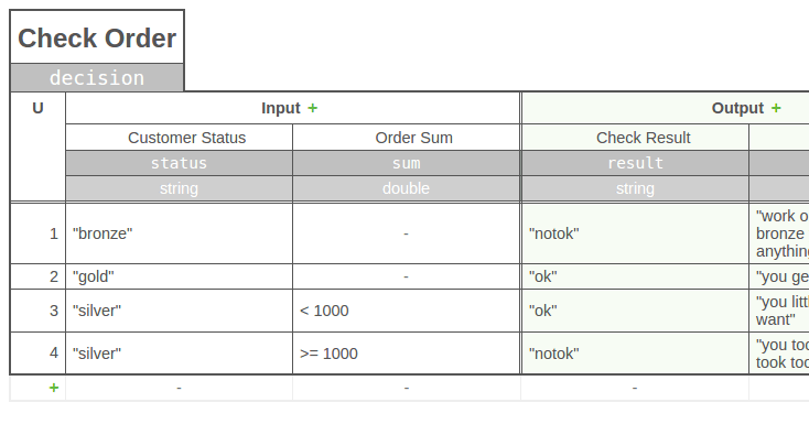
- Contextual drag handles: The handles used to order columns are now only shown when the mouse hovers over the column or row instead of all the time.
Less ceremony in the context menu: the animations were removed from the context menu (opens on right click).
The bpmn.io icon was moved out of the decision table itself into the top-right corner.
Provide Feedback
Make sure to follow us on Mastodon if you would like to keep track on what is happening around our project. We are interested in feedback on our latest modeling improvements! Make sure to reach out to us via our forums and tell us what you think.
Get the latest release of our DMN toolkit via npm or bower.
Are you passionate about JavaScript, modeling, and the web?
Join Camunda and build modeling tools people  .
.