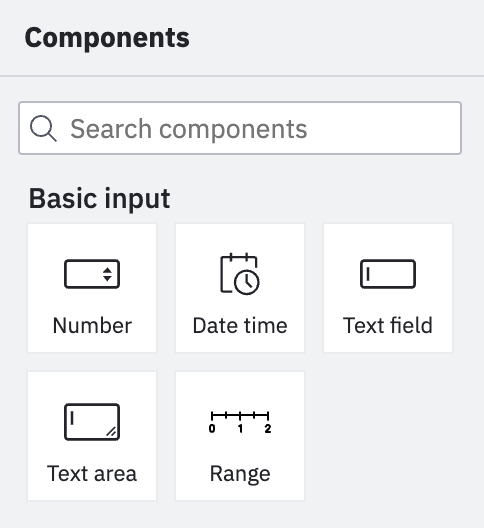
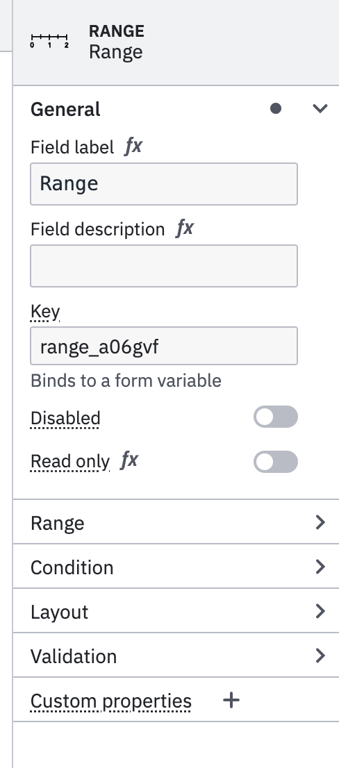
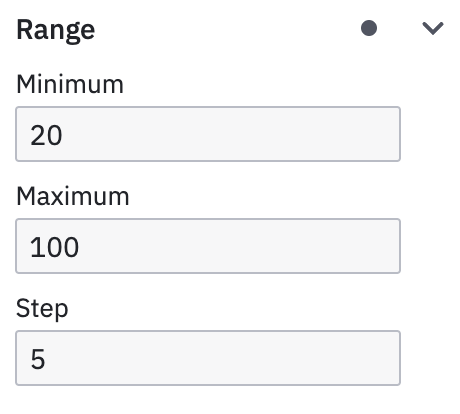
We are excited to inform you about the latest form-js improvements that add new extension capabilities to create custom form components. It is easier now to use existing form-js components in your custom renderers and provide properties panel extensions.
The ability to create custom form components was a long-awaited feature. With the recent form-js@1.4.0 release, we added extension features to the toolkit in the nature of common bpmn-io extension patterns.
Check out our example to gather more insights about the new extension capabilities.
Define a custom form component renderer
Creating and registering custom form components with a Preact component was already possible. It is now also possible to use existing core form-js components in the renderer.
import {
  Errors,
  Description,
  Label
} from '@bpmn-io/form-js';

import {
  html
} from 'diagram-js/lib/ui';

export function RangeRenderer(props) {

  // ...

  return html`<div class="my-component-wrapper">
    <${Label}
      id=${ prefixId(id, formId) }
      label=${ label } />
    <div class="my-form-component">
      // ...
    </div>
    <${Description} description=${ description } />
    <${Errors} errors=${ errors } id=${ errorMessageId } />
  </div>`;
}We also added new options to a form field config object. For example, you can now define the default properties panel entries that should be shown in the form editor. You can also specify an icon for the form component.
import {
  Numberfield
} from '@bpmn-io/form-js';

RangeRenderer.config = {

  /* we can even extend the configuration of existing fields */
  ...Numberfield.config,
  type: rangeType,
  label: 'Range',
  iconUrl: `data:image/svg+xml,${ encodeURIComponent(RangeIcon) }`,
  propertiesPanelEntries: [
    'key',
    'label',
    'description',
    'min',
    'max',
    'disabled',
    'readonly'
  ]
};
That's all! The component library and properties panel will be automatically updated with the new form component, and the renderer will take over the rendering of the form component.
Please find out more about rendering extensions in our dedicated example.
Create a properties panel extension
We added the ability to extend the properties panel with custom entries. We mirrored the proven provider architecture of other bpmn.io properties panel libraries.
Next to the propertiesPanelEntries we described above, you can create a properties provider that can add, remove, and modify existing entries.
export class CustomPropertiesProvider {
  constructor(propertiesPanel) {
    propertiesPanel.registerProvider(this, 500);
  }

  getGroups(field, editField) {

    ...
    return (groups) => {

      if (field.type !== 'range') {
        return groups;
      }

      const generalIdx = findGroupIdx(groups, 'general');

      groups.splice(generalIdx + 1, 0, {
        id: 'range',
        label: 'Range',
        entries: RangeEntries(field, editField)
      });

      return groups;
    };
  }
}Find out more about properties panel extensions in our dedicated example.
Plugging everything together
You can plug your custom modules into the different form-js components as viewerAdditionalModules and editorAdditionalModules. With the latest release, we also added the additionalModules option that allows you to provide extensions to both simultaneously, for example, the renderer.
import { FormPlayground } from '@bpmn-io/form-js';

new FormPlayground({
  container,
  schema,
  data,
  additionalModules: [
    RenderExtension
  ],
  editorAdditionalModules: [
    PropertiesPanelExtension
  ]
});
Wrapping Up
We'd love to hear your feedback on the new extension capabilities. We are looking forward to seeing what you build upon the new features!
Did we miss anything? Did you spot a bug, or would you like to suggest an improvement? Reach out to us via our forums, toot us on Mastodon, or file an issue you found in the form-js issue tracker.
Get the latest Forms modeling toolkit pre-packaged or as source code via npm or unpkg.
Are you passionate about JavaScript, modeling, and the web?
Join Camunda and build modeling tools people 


